Cele|bitchy |
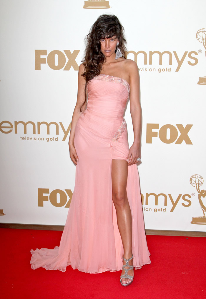
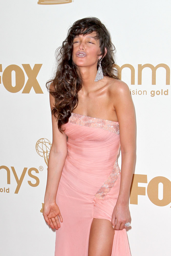
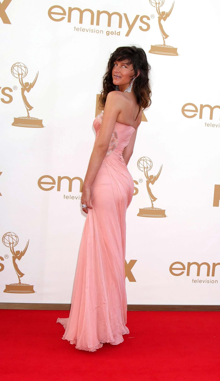
- Paz de la Huerta in ballerina pink w/silver lipstick: truly awful or simply Paz?
- Heidi Klum in Christian Siriano: avant-garde gorgeous, or just tacky & fug?
- David Beckham gets ladies to smell his leg at Target (video)
- Sofia Vergara in salmon Vera Wang: stunning, boring or fug?
- Maria Bello in Kaufmanfranco: one of the best-dressed of the night?
- Claire Danes in metallic blue Oscar de la Renta: “edgy” or too severe?
- Christina Hendricks in Johanna Johnson: flattering, pretty or too much?
- Peter Dinklage wins for Game of Thrones, where are the rest of the hot guys from GOT?
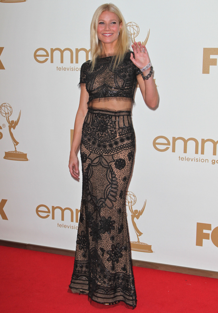
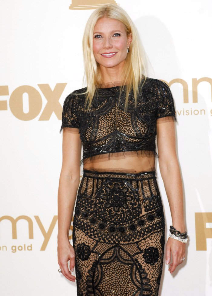
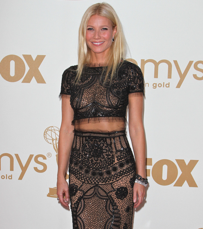
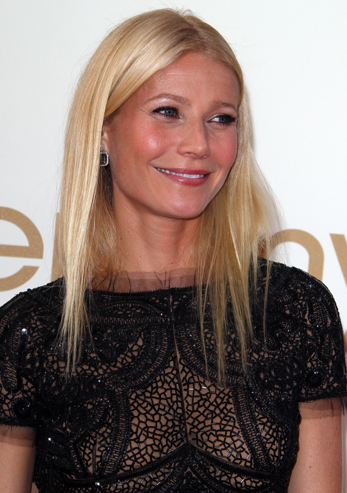
- Gwyneth Paltrow in belly-baring, beaded Pucci: dated, fug or hot?
- Netflix apologies, renames their DVD service “Qwikster” WTH?
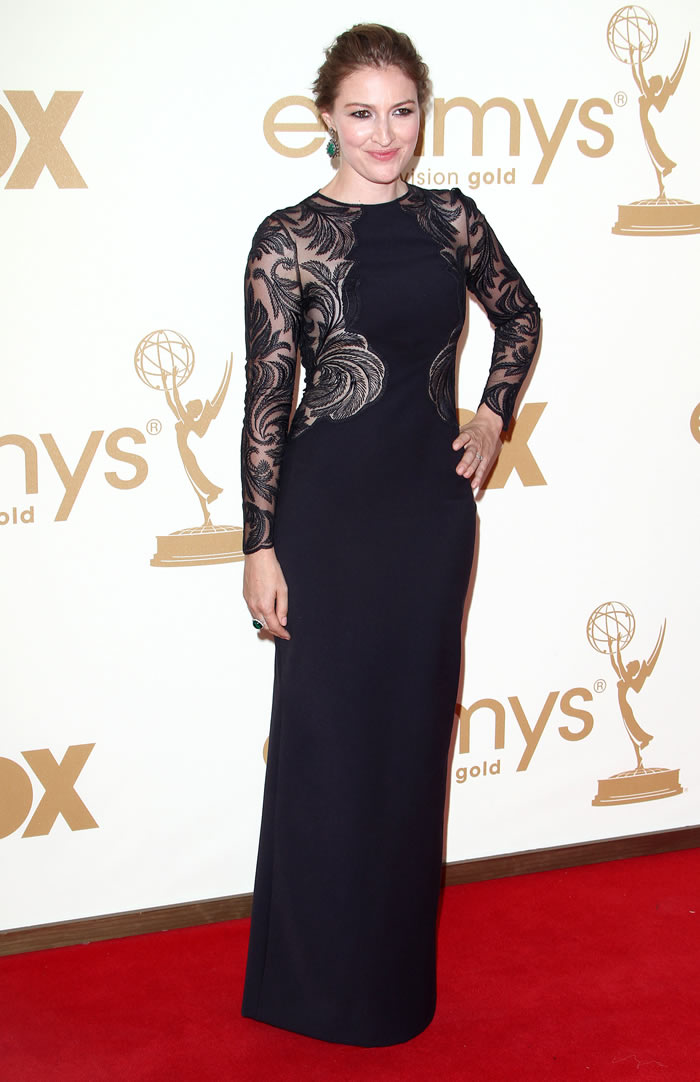
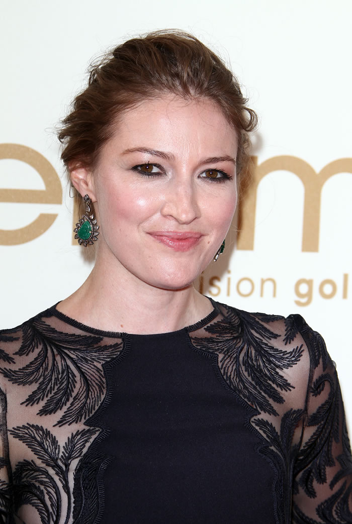
| Paz de la Huerta in ballerina pink w/silver lipstick: truly awful or simply Paz? Posted: 19 Sep 2011 08:43 AM PDT Of course, Paz de la Huerta stumbled down the red carpet last night at the Emmys in one of her typically sleazy ensembles, but I’ve been sidelined from her entire look by that distracting, boob-hugging curl that’s trailing down the right side of her torso. Is that new? It wasn’t visible last week when Paz briefly cleaned up (in her own way), so it’s probably just a clip on curl. Thankfully, Paz wasn’t presenting (can you imagine?) but was merely in attendance to support the Boardwalk Empire nominations (one of which resulted in a Best Director, Drama Series for Martin Scorsese). For this momentous occasion, Paz donned a ballerina pink, body hugging gown that was intentionally sliced to reveal one thigh. While the cut of the dress isn’t anything that we wouldn’t expect from Paz, the color is definitely an odd choice, but perhaps she was trying to look the part of the ingenue. I’ll let that one soak in for a moment… As is often the case, Paz’s makeup was pretty horrible — she basically ignores her eyes in favor of playing up her lips. That’s her thing, I guess, but the silvery lipstick really makes her look like one of the undead. Naturally, the Paz booty was in full effect. She’s such a terrible mess. God, I love her. Also in tow from the Boardwalk Empire cast was the generally lovely Kelly MacDonald in a matronly black gown with some see-thru tapestry on the sleeves and semi-boob area, which was accessorized some huge, ugly green earrings and messy, unflattering hair. Kelly is such a beautiful woman, but she’s almost more of a mess here than Paz. Then again, Kelly is a much more talented actress too — I loved her in No Country for Old Men, where she convincingly did away with her native Scottish tongue in favor of an altogether authentic Texan accent. That’s something that most American actresses fail to pull off these days. Now, if she could only find a better stylist. Photos courtesy of Fame and WENN      |
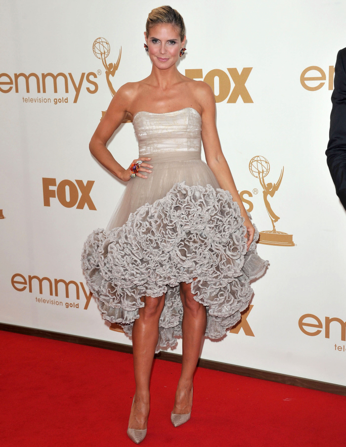
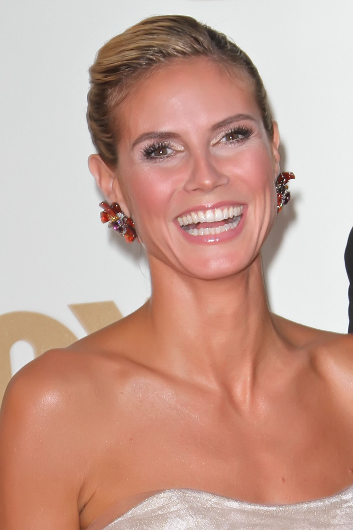
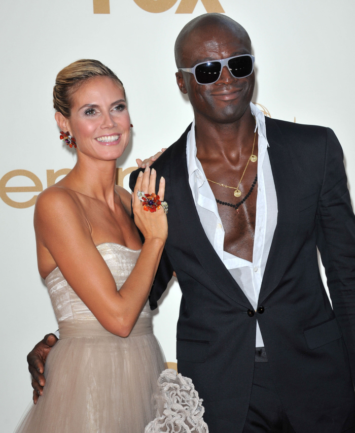
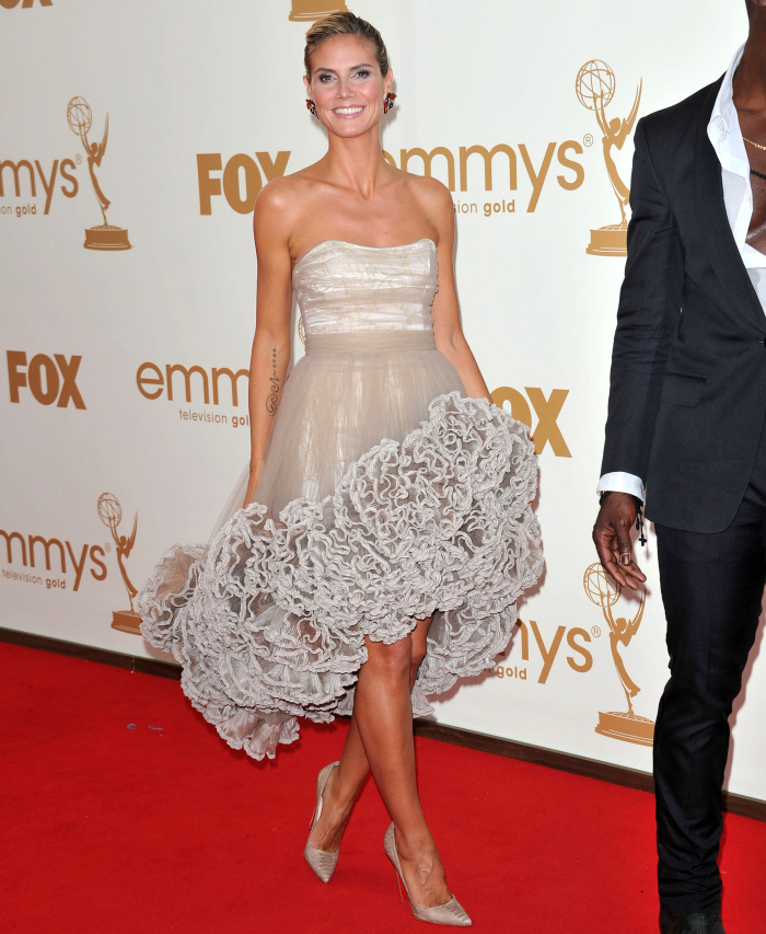
| Heidi Klum in Christian Siriano: avant-garde gorgeous, or just tacky & fug? Posted: 19 Sep 2011 08:24 AM PDT I like the idea of Heidi Klum wearing a previous Project Runway winner. I especially like that she wore a dress by Christian Siriano, who is probably my favorite of all of the winners - and notice that Heidi isn't wearing anything by Gretchen Jones, last season's KNIT GRANNY PANTY-designing winner. Anyway, so… I like the idea of that Klum and Siriano were collaborating, but this dress… it's just a train wreck. From start to finish. It's the wrong color for Heidi, first of all. Second of all, it makes her look flat-chested, which she isn't. Third, THAT CRAP ON THE BOTTOM. Yikes. Here's the problem with Heidi: everybody always kisses her ass as far as style goes. Maybe it's because of Project Runway, maybe it's because she was a model for so long, and people assume she knows a lot about fashion, but Heidi consistently disappoints me on the red carpet, if she isn't outright horrifying me. She's consistently over- or under-dressed, like she doesn't know how far or how pulled-back she should go. I guess she thinks that it doesn't matter, because she can pull off anything, but she can't, in reality. Really dissect this look and look at all of the stuff going wrong. She's wearing too much makeup. Her hair doesn't suit her face, and it looks oily and damaged. The jewelry is wrong. Every part of the dress is wrong for a woman of her age and body type. It's all just a mess. One of the worst-dressed of the night. Oh, and I like Heidi. I like Heidi and Seal - but she needs to tell him to button it up. It's not the Grammys, it's the Emmys. We don't need to see all of that. |
| David Beckham gets ladies to smell his leg at Target (video) Posted: 19 Sep 2011 08:08 AM PDT
Ellen got a little too bossy with David, but the result was funny. There were about 10 women clustered around him when Ellen had him call out to a random woman with a shopping cart who didn’t want to have anything to do with him. (That’s at 2:30) He started singing “if you stink, come and buy cologne,” although he first said “if you think,” because he didn’t understand what Ellen was telling him. Ellen made him spray everyone indiscriminately and she told him to tell one guy to steal the cologne. It got kind of dumb at the end but David was game for it. I hate cologne and perfumes and I would have avoided this dude. Beckham really looked like a dorky sales guy acting crazy. I think it was the hat and the glasses that helped disguise his hotness. Plus let’s face it, even if a guy had Beckham’s body, face and accent, if he worked at Target and acted like that would you even give him the time of day? Beckham is shown in July and August. Credit: WENN.com |
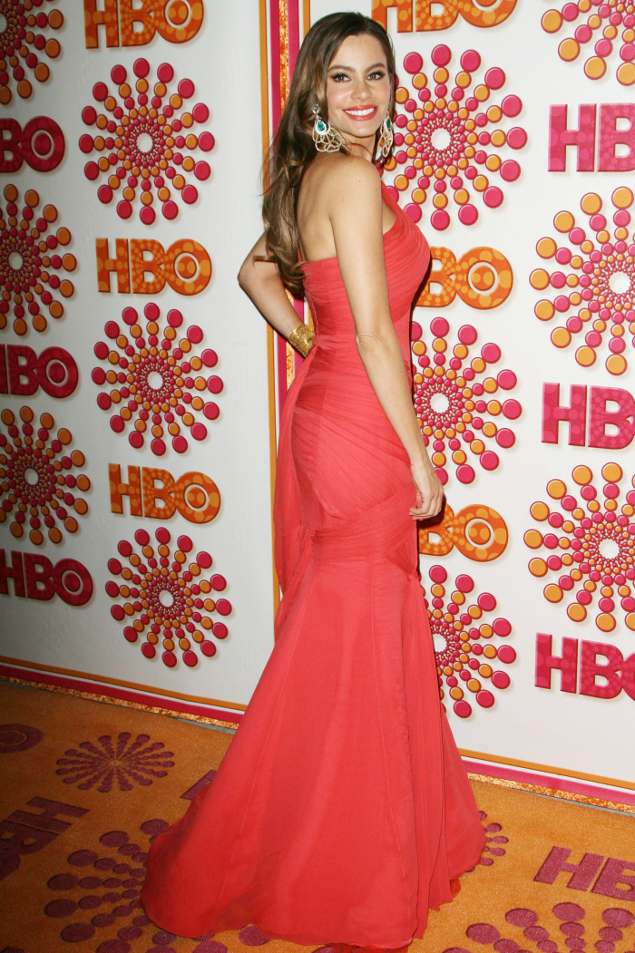
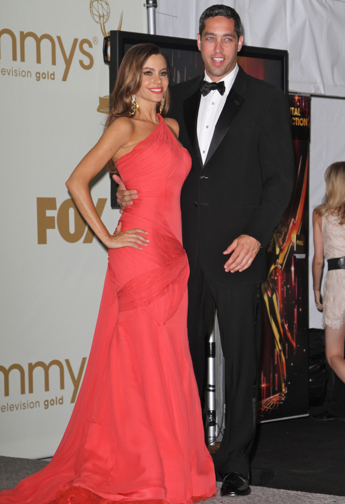
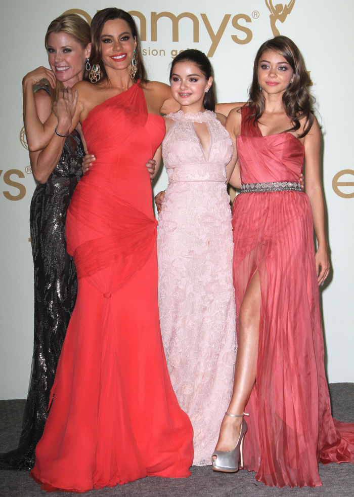
| Sofia Vergara in salmon Vera Wang: stunning, boring or fug? Posted: 19 Sep 2011 08:01 AM PDT I burst out laughing when Sofia Vergara was talking to Ryan Seacrest about her dress. Look, it's not like I'm in the habit of making fun of accents - longtime readers know that I love an accent, and hey, my dad's an immigrant, so I grew up hearing English spoken with an accent. I just think Sofia's Colombian accent is oversized and she works it harder for comedic effect. Like, when she told Seacrest that her dress was Vera Wang, it's like Sofia's mouth couldn't form the appropriate sounds and it came out as "Vaaaa-rrrra WO-ONG!" It was ridiculous and yes, I laughed at her accent. So here is Sofia in Vara WONG (said with a roll of "r" and by drawing out the "wong" to make it into a two syllables). I love the color on Sofia - the salmon-pink is just gorgeous. The fit is great, it's flattering, her girls aren't spilling out and she looks like a goddess. She was one of my favorites of the night too, but I did dislike two parts of her styling: I disliked the "sleek" hairstyle, which just seemed "flat" to me, and I HATED those earrings, which were much too big for Sofia. That face is gorgeous - why draw attention away from it with gigantic earrings? And the pop of emerald green against the salmon… it did nothing. But, as I said, those were my only issues, and the dress is gorgeous. I included a photo of Sofia with her boyfriend, Nick, who… I don't know, I kind of think Sofia is over it. And there's one of the young girls from Modern Family. One of the things I like so much about that show is that it feels like all of the adult actors love and adore the child actors, and look out for them. They just seem like a tight-knit group. I hope there's no drama. |
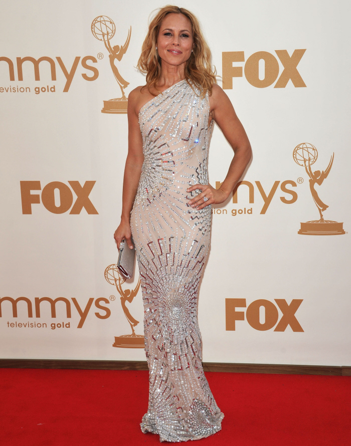
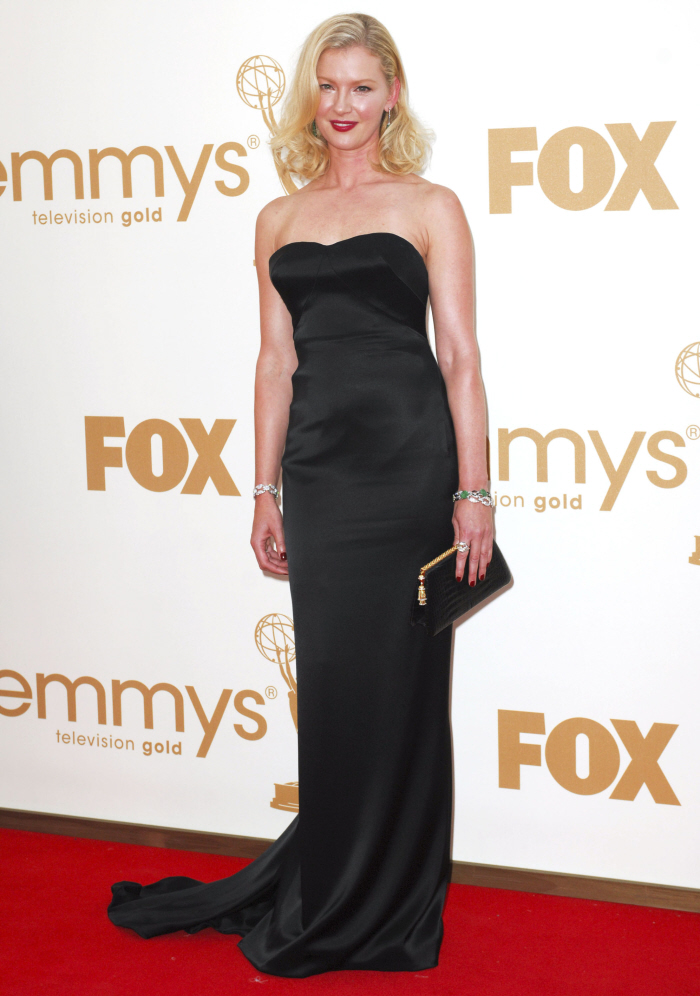
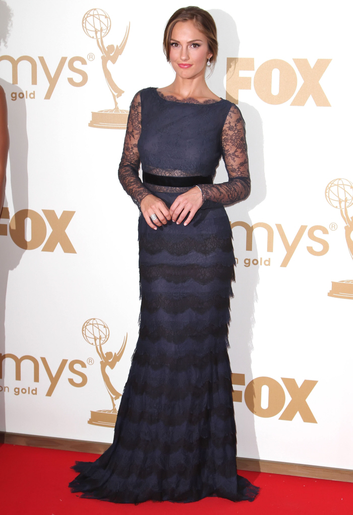
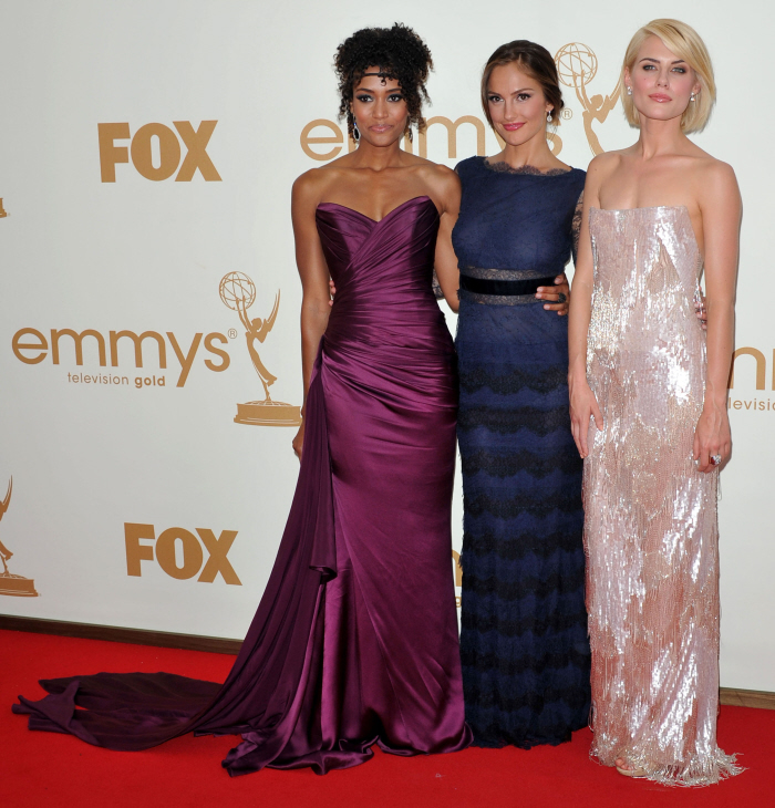
| Maria Bello in Kaufmanfranco: one of the best-dressed of the night? Posted: 19 Sep 2011 07:29 AM PDT These are just some extra ladies that maybe didn't deserve their own individual posts, although they were noteworthy enough to mention here. First up: Maria Bello in Kaufmanfranco. This was actually one of my favorite dresses of the night, and I think Maria was one of the best-dressed ladies, overall. She was just there as a presenter, because she's coming out with Prime Suspect, the American remake of the British cop show starring Helen Mirren. Maria has big shoes to fill, and I'm looking forward to seeing this series, honestly. I love this entire look - the dress, the hair, the makeup. She looks beautiful, but it's not a showy, "LOOK AT ME" outfit, which is nice for a presenter. Also: Maria has a cute ass. Next: Gretchen Mol in L'Wren Scott. I often wonder why more women don't choose L'Wren for big red carpet events, because L'Wren gowns are often understated, impeccable, classic and beautiful. But maybe the problem is that if you put a classic, deceptively simple dress on someone boring like Gretchen, it just reads as a snorefest. Gretchen is just… zzzzz….. Last: Minka Kelly, Rachael Taylor and Annie Ilonzeh, the new Charlie's Angels. Minka is in Dior, Taylor in Armani, and Annie is in Romona Keveza. Minka lost a real opportunity to take it to the next level here - she could be "The Next Blake Lively" you know? I mean that she could be the go-to "hot girl" with a great figure who gets invited everywhere, and then starts doing movies. Instead, Minka just wore a boring old-lady dress with doily sleeves and she looked terrible. Out of all of them, I really like Annie's dress - that's a beautiful color on her. I could do without the headpiece thing, though. |
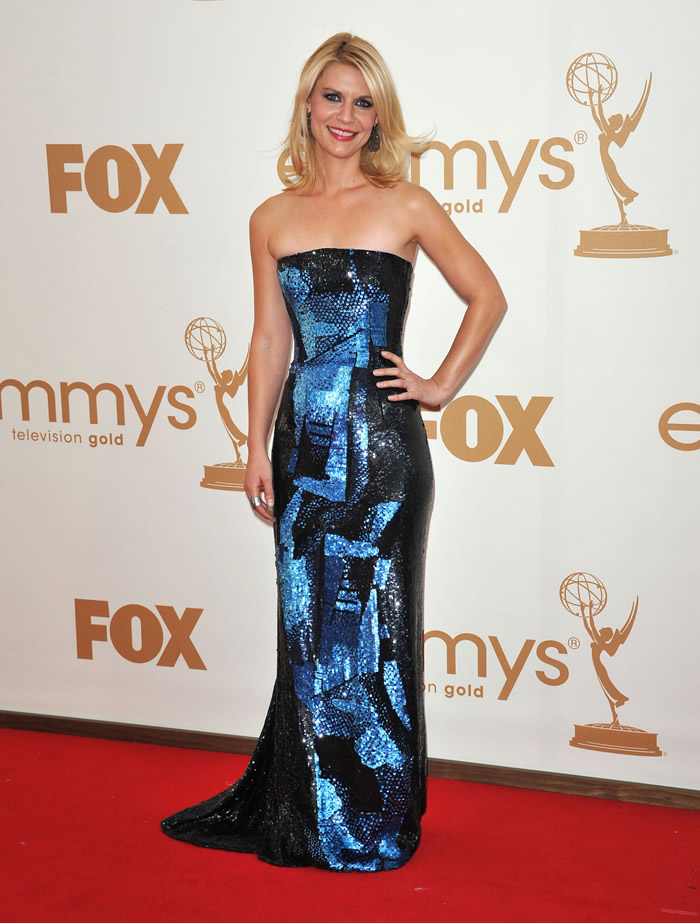
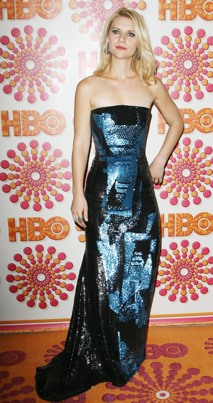
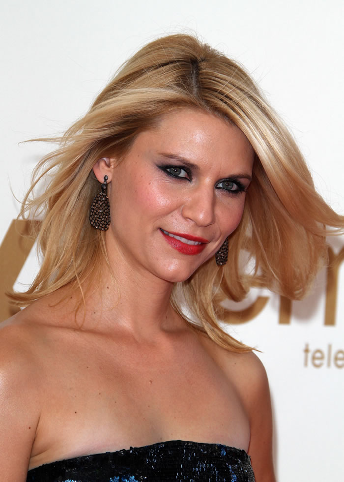
| Claire Danes in metallic blue Oscar de la Renta: “edgy” or too severe? Posted: 19 Sep 2011 07:04 AM PDT Claire Danes attended the Emmys last night as a presenter (she won last year in the Outstanding Lead Actress in a Miniseries or a Movie category for her role in Temple Grandin), and I’ve got mixed feelings about her look for the evening. She wore a metallic blue Oscar De La Renta column dress, which I believe was intended to be edgier than all of the monochrome and minimalistic dresses that she has favored in the past. I like that she’s mixing it up a bit, and I love the deep blues of the dress itself. It also looks a lot better against the HBO backdrop than against the standard-issue Emmy red-carpet wall. What gives me pause about Claire is her hair and makeup. Kaiser thinks the hair should be a few shades darker, and I agree that she’s just far too blonde and highlighted at this point, but she’s been that way for quite awhile. Claire’s stuck in a bit of a beauty rut, and I’d like to see her try out a cool shade of brunette or, at the very least, go for some rich lowlights instead of defaulting to the Hollywood standard blonde. In terms of makeup, the lipstick is fine, but the eyeliner is applied in far too gratuitous a manner. Again, I think Claire is going for “edgy” here, so that excuses some of this mess. Sadly, her adorable husband Hugh Dancy was nowhere to be seem. Maybe he had a TIFF hangover and couldn’t handle the sparkle factor of this dress. Photos courtesy of Fame and WENN 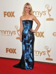   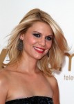 |
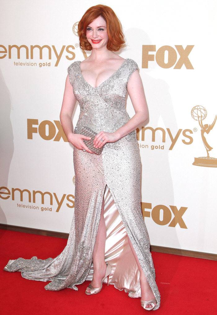
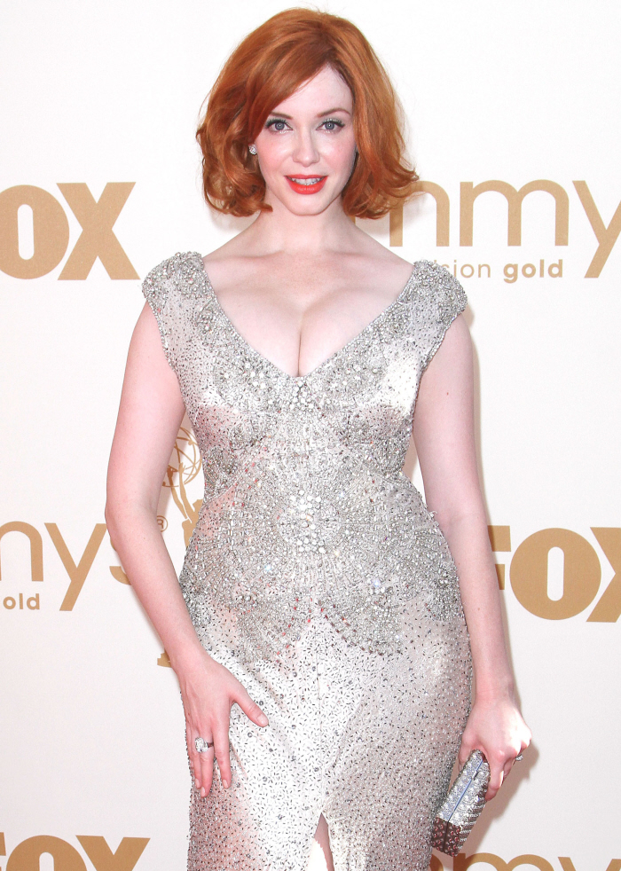
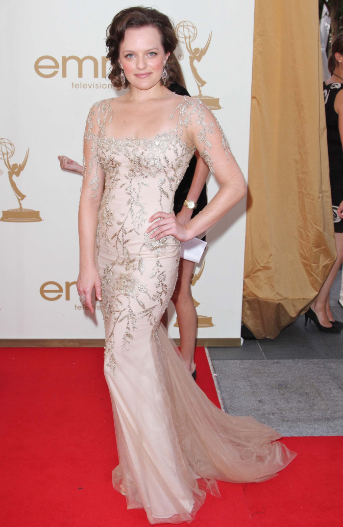
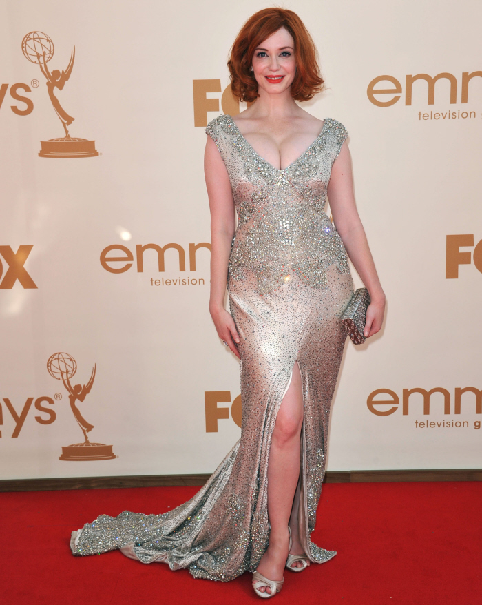
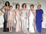
| Christina Hendricks in Johanna Johnson: flattering, pretty or too much? Posted: 19 Sep 2011 07:03 AM PDT You know that I love Christina Hendricks, right? And that I'm often blind to her style faults, of which she has many. I think Christina's biggest problem might be that she doesn't seem to know what to do with her (store-bought) boobs? She tries giving them boob-caplets, she tries jacking them to high heaven, she tries covering them up in boob burqas, but they're just SO BIG. It's like nothing can really be done with them. Anyway, last night, Christina decided to jack them to high heaven in this heavy-looking beaded gown by Johanna Johnson. What I like: the neckline is pretty, and her boobs don't look as jacked as they did in that rose Vivienne Westwood. I also like the beading on the top part - I actually everything from the waist up and the neck down. That part of the gown photographed beautifully. But from the waist down… well, there were issues. There was heavy beading on the hem which made the dress look too "heavy" and the extra bottom glitter was unnecessary - no one's looking at her heels, you know? It's Christina - we're looking at her boobs, don't even try to draw the eye down. Plus, the front slit was much, much too high. It felt like we were about to see whether the carpets matched the drapes. As for her styling…I liked her hair. I liked that there were no bangs, and that her hair looked fluffy and breezy. Her makeup looked overdone when she was talking to Ryan Seacrest, but in these photos, it's fine. The white-silver of the gown washes her out a little bit, but she's not at Code Red: Corpsey. I also included a photo of Elisabeth Moss in Marchesa. The dress suits her, and it's pretty flattering for her figure. Her hair was a hot mess, though. I think Moss is just one of those girls who always has hair issues, though. There's also a photo of the ladies of Mad Men - I liked Cara Buono's vintage-looking gown, and of course, I loved Kiernan Shipka's little party dress. She's such a cutie. And there's Mrs. Blankenship! Huzzah. |
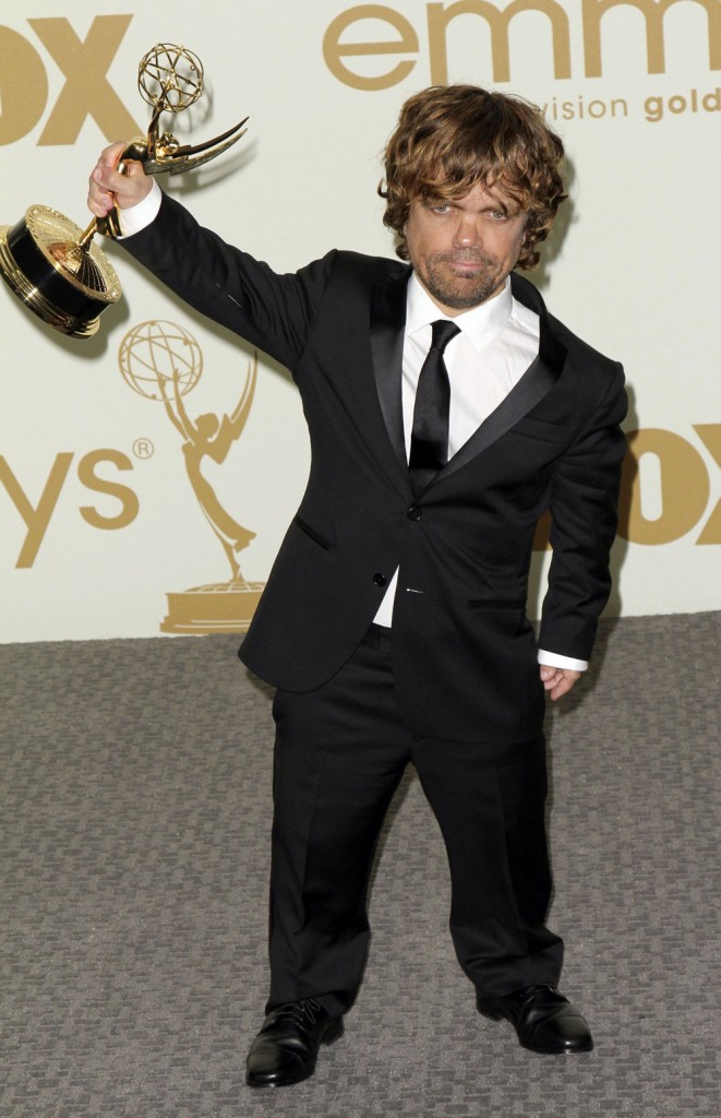
| Peter Dinklage wins for Game of Thrones, where are the rest of the hot guys from GOT? Posted: 19 Sep 2011 06:59 AM PDT
During his acceptance speech (below), Peter thanked the writers David Benioff and Dan Weiss, along with HBO. He also thanked his “dog sitter, whose name is Kitty, for taking care of my dog Kevin back in NY,” gave a shout out to the other nominees and told his wife he loved her. “I love you Erica, you’re amazing.”
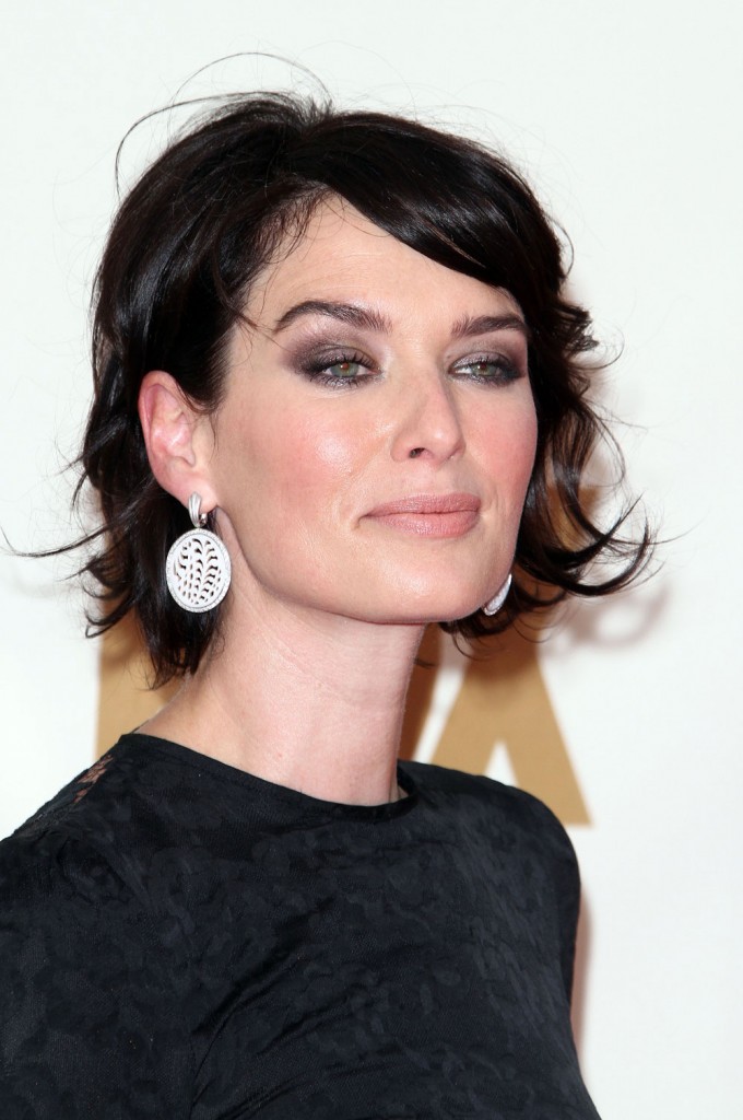
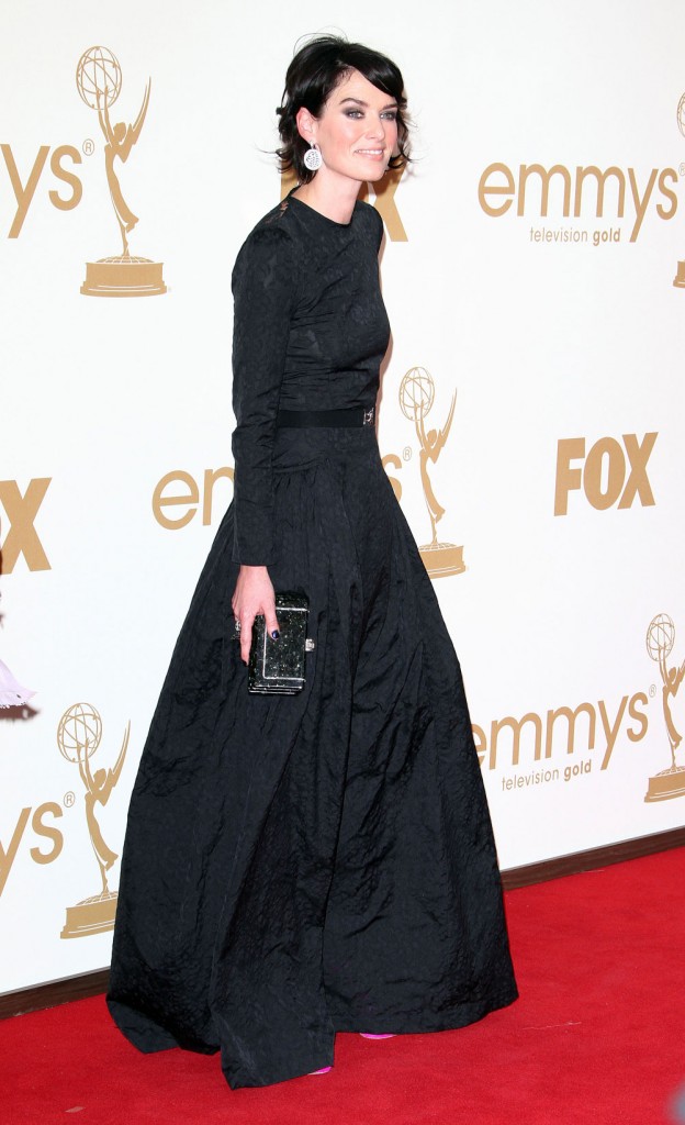
The evil queen Cersei Lannister was there, though. Lena Headey’s Botox face on GOT bugs me so much. She has dark hair when she’s not in character, and she’s a hipster with a lack of style. I recently saw some photos of her at Comic Con and she looked like a cartoon character she was dressed so poorly. Here she is looking smug in head to toe black. Our photo agency, Fame, didn’t even know who she was and labeled another dark-haired actress as Lena. Here’s how she looks on the show. All she can do is squint.         Photo credit: Juan Rico/Fame |
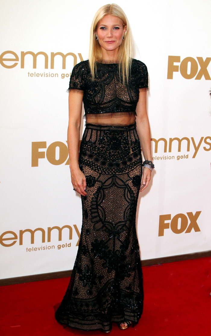
| Gwyneth Paltrow in belly-baring, beaded Pucci: dated, fug or hot? Posted: 19 Sep 2011 06:33 AM PDT When Gwyneth Paltrow was walking the red carpet, I was having a bitch of a time figuring out what part of her dress was lined and what part was see-through. In still photos, I think I've figured it out - we're actually seeing Goop's stomach, right? But we're not seeing her legs? Is the skirt of this dress fully lined, or did I make out some actual skin down there? I think we'll looking at lining in the skirt. The dress is Pucci, which is interesting, I guess. Goop's been wearing more and more Pucci in the past year. I think I would have really, genuinely liked the dress if the beaded lace had been done throughout, and there was no "faux crop-top circa 1994" action happening. As for the "see through" part, which I thought was an unflattering leather belt at first… tragic. Here's the thing about our Dame Goop: she works hard for her body. She diets and she exercises like crazy, and having a great body and showing it off in clothes - that's what Gwyneth lives for. This is her life's work, what we see here, more than any acting gig. The problem? With all of the work she puts into her body, she still has a square-shaped body, and this dress doesn't do anything for it. It makes her look even boxier. Plus, there's still the "sexiness" problem with Goop. Even when she's undressed, even when she's showing off her body… there's nothing sexy about her. She's just an icy, smug blonde with a nice figure that no one gets hot for. As for the styling… I LOL'd when I saw that Goop had flat-ironed her hair AGAIN. She does it for all red carpets now! Because Goop is stuck in 1997, when she was at the height of her fame and smug, self-satisfied importance. She just looks so dated to me - this is not a style trendsetter anymore, this is just some woman who used to be very famous and she still dresses like she's in her 20s. Photos courtesy of Fame & WENN. |
| Netflix apologies, renames their DVD service “Qwikster” WTH? Posted: 19 Sep 2011 06:07 AM PDT
So there’s a lot of drama recently over Netflix raising prices for the one DVD plus unlimited streaming option from $10 a month to $16 a month. (They still offer $7.99/month streaming only packages or one DVD for that price, not both.) Plus Netflix recently lost their contract with Starz entertainment, which means that as of February 2012, all Starz content (including films from Disney and Sony) will be removed from Netflix streaming. This lead to a stock price drop, along with a loss of a whopping 600,000 subscribers from June to September. (They have 25 million subscribers.) Anyway Netflix just sent out an apology to their existing subscribers (I have the streaming only option, but I don’t know for how much longer I’ll keep it) along with an announcement that they’re going to rename their DVD service “Qwikster.” What is this, 1997? That’s ridiculous. Aren’t they afraid they’re going to get confused with “Flixster“? Plus, it has creative spelling that makes it easily confused with “Quixster,” which is how I originally read it because it’s closer to “Netflix,” or “Quickster,” because that’s how you spell “Quick.” They never even bought the Quixster or Quickster domains. They probably chose this creative spelling because those other domains were taken. This is a startup move, not something a huge company should be doing.
[Received via e-mail, more at blog.netflix.com] So they’re apologizing, but they’re not giving anything to subscribers at all except they’re calling the DVD part “Qwikster” and charging them separately for it. It’s nice that they’re saying they’re sorry for it, but they’re not changing anything except restructuring their business and making a separate brand. It’s all about Netflix and what they want and they’re not even throwing people a bone. It’s stupid, it’s marketing-driven not costumer-driver, and it’s not going to help Netflix recover at all since they’re not giving people anything and no one is going to remember how to spell “Qwikster.” It’s clear that Netflix is going down fast. Plus, and I rarely ever do this but I’m going to make this all caps, they’re announcing that they’re renaming their service Qwikster.com and that they’ll be doing DVD business from Qwikster, but THEY DON’T EVEN HAVE THE QWIKSTER WEBSITE UP YET! 1997 indeed. That’s when Blockbuster was doing well, remember? Here’s a budget video from their CEO and the new CEO of “Qwikster.” So dumb. The new Quikster CEO looks kind of pissed. |
| You are subscribed to email updates from Cele|bitchy To stop receiving these emails, you may unsubscribe now. | Email delivery powered by Google |
| Google Inc., 20 West Kinzie, Chicago IL USA 60610 | |


